But then I googled him....
As it turns out, he was mainly famous for mass reproductions of his work that people could buy at an affordable cost, and hence the most possessed by common people. And just like it does most of the times after over-inspection, his work lost its charm on me. I started noticing a cartoonish, fantastical feel in his work, and not necessarily in a good way.
Luckily for me, a few months ago I stumbled upon Helen White's work. She is a UK based artist, who does this beautiful photo-realistic work with light. And she also shares my other love, windows! At this point I almost want to thank Helen for doing her art and keeping the 'torch' lit for me.
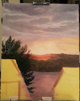
This painting is based on a picture taken from my living room window which overlooks the Indian lake. The sun was setting, bathing the sky and the back forest in beautiful colors.
According to my current teacher at the Worcester Art Museum, the sky still looks like an under-painting.
I added some more light greens in the bushes and slightly corrected the direction of the reflection on water.
Here, I added made the reflection more orange than yellow and added more
file lines of orange across the rest of the water. The lines might not
be very apparent as it was a thinned out paint, but I am hoping it gets
the feel of very small waves. I need to add more greens to the bottom
layer of trees such that it almost forms a halo.The paint photographs differently in day time as compared to at night time as in previous two pictures.
I added the basic color to the houses lines for sidings and shingles, and the second tree on right.
I
added a stronger perspective to the shingles on the left house than
needed. In fact, if I add any significant increase in the shingle sizes
going from top to bottom, I am going to end up in trouble with respect
to the right side portion of the roof of the same house as that does not
increase in size top to bottom. As I am typing this now, I can also see
the problem with clouds that Ella pointed out.
After
waiting a few days, I changed the colors of the roof and the left
house, added some details to the left window. I should add the siding
lines to it, but I don't want to draw them as I did in the right house. I
do not necessarily like that effect.


No comments:
Post a Comment